Grade 6 data and graphing worksheets: Creating and interpreting graphs
-
Do you want to reinforce your 6th grader’s data and graphing skills with fun and engaging activities? If so, you’ve come to the right place. In this article, we’ll share why data and graphs are useful for 6th graders, simple steps to follow when creating and interpreting graphs, and where to find enriching Grade 6 data and graphing worksheets for your students.
How to make and read graphs: Activities and worksheets for 6th Grade
Do your students like puzzles, games, and stories? Do they enjoy finding out new things and sharing them with others? If you answered yes, they might also love these data and graphing activities and worksheets for 6th Grade! In this article, they will learn how to make and read different types of graphs using data from various sources. They will also discover how to use data and graphing skills to have fun and learn more about their favorite topics.
Data and graphing are ways of collecting, organizing, and visually presenting information. They can help us explore the world around us, answer questions, solve problems, and communicate our ideas better.
So, by the end of this article, your 6th-grade students will see that data and graphing are useful, exciting, and creative!
-
BROWSE THE WEBSITE
-
DOWNLOAD FREE WORKSHEETS
-
-
GRADE 6 MATH TOPICS
- Whole numbers
- Multiplication
- Division
- Exponents and square roots
- Number theory
- Decimals
- Add & subtract decimals
- Multiply & divide decimals
- Fractions & mixed numbers
- Add & subtract fractions
- Multiply fractions
- Divide fractions
- Integers
- Operations with integers
- Mixed operations
- Rational numbers
- Problems solving
- Ratio & proportions
- Percentages
- Measuring units
- Money math
- Consumer math
- Telling time
- Coordinate graph
- Algebraic expressions
- One step equations
- Solve & graph inequalities
- Two-step equations
- 2D Geometry
- Symmetry & transformation
- 3D Shapes
- Geometry measurement
- Data and Graphs
- Statistics
- Probability
-
Buying is supporting us!
Buy Now...

-
-
What are data and graphs, and why are they useful for 6th graders?
Data are pieces of information that can be measured or counted. For example, the number of students in your class, the colors of your clothes, the temperature of the day, and the scores of a game are all data. We can collect data by observing, surveying, experimenting, or researching.
Graphs are visual representations of data that show how they are related or change over time. For example, a bar graph can show how many students prefer different types of music, a line graph can show how the temperature changes throughout the year, and a pie chart can show how the scores of a game are distributed among players.
Graphs can help us understand data better by making them easier to compare, analyze, and communicate. For 6th graders, data and graphing are useful skills because they can help them with math, science, social studies, and other subjects. They can also help them develop critical thinking, creativity, and communication skills to prepare them for future challenges.
-
Types of data: How to classify data into categories, numerical or ordinal
There are three main types of data that we can use to make graphs: categorical, numerical, and ordinal.
Categorical data are data that belong to different groups or categories. For example, the names of animals, the types of fruits, and the colors of cars are categorical data. We can use words or symbols to label categorical data.
Numerical data are data that have numerical values or measurements. For example, the heights of plants, the weights of rocks, and the distances of planets are numerical data. We can use numbers or units to label numerical data.
Ordinal data are data that have an order or rank. For example, the student's grades, the ratings of movies, and the difficulty levels are ordinal data. We can use numbers or words to label ordinal data.
-
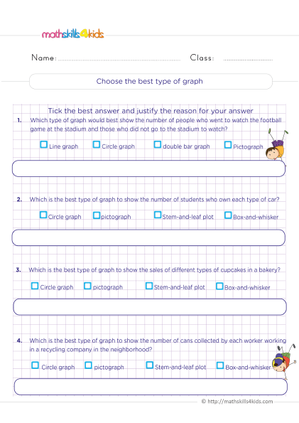
Types of graphs: How to choose the best graph for different types of data
We can use many types of graphs to display different types of data. The most common are bar graphs, line graphs, pie charts, pictographs, histograms, scatter plots, and stem-and-leaf plots. Each type of graph has its advantages and disadvantages depending on the type of data and the purpose of the graph. Here are some general guidelines on how to choose the best graph for different types of data:
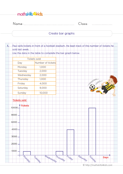
- Bar graphs: Use bar graphs to compare categorical or ordinal data across groups or categories. For example, we can use a bar graph to show how many students like different types of sports.
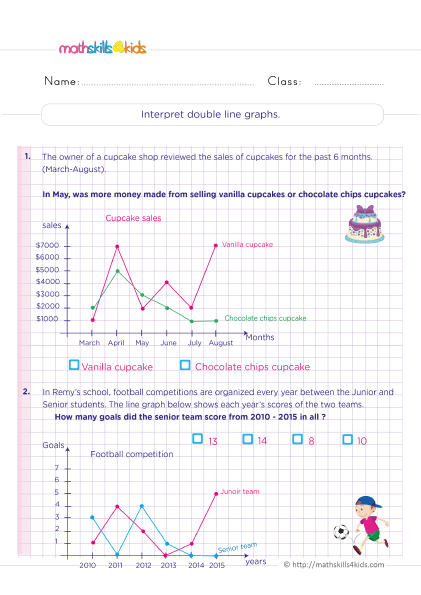
- Line graphs: Use line graphs to show numerical data that change over time or across a continuous variable. For example, we can use a line graph to show how people’s height changes as they grow older.
- Pie charts: Use pie charts to show categorical or ordinal data as parts of a whole or percentages. For example, we can use a pie chart to show how much time we spend on different daily activities.
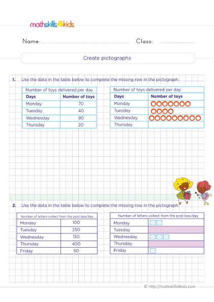
- Pictographs: Use pictographs to show categorical or ordinal data using pictures or symbols representing a specific number or amount. For example, we can use a pictograph to show how many books we read in a month using book icons.
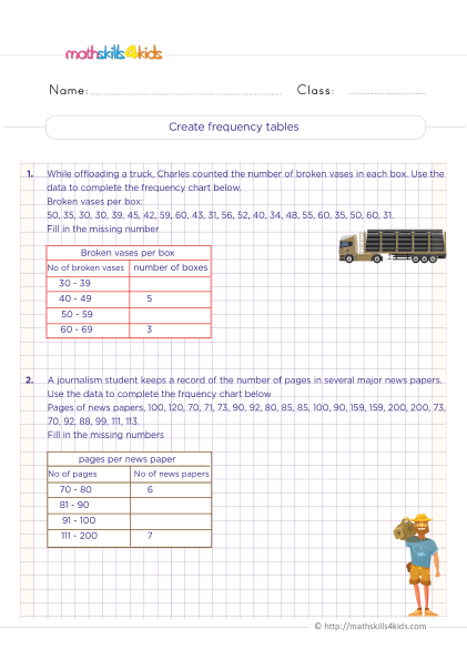
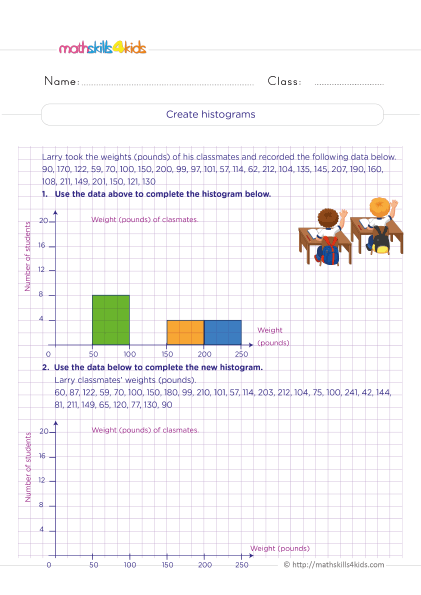
- Histograms: Use histograms to show numerical data grouped into intervals or bins. For example, a histogram can show how many students have different heights in a class.
- Scatter plots: Scatter plots show numerical data with two variables or dimensions. For example, we can use a scatter plot to show how the weight and height of students are related.
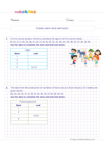
- Stem-and-leaf plots: Use stem-and-leaf plots to show numerical data with two or more digits. For example, we can use a stem-and-leaf plot to show how many points each player scored in a game.
-
Creating graphs: How to use tables, scales, labels, and titles to make graphs
Before creating a graph, we must organize our data in a table. A table is a way of arranging data in rows and columns. A table can help us see the patterns and relationships in our data more clearly. To make a table, we’ll decide what variables or categories to include and how to label them. For example, if you want to make a bar graph of how many students like different types of music, you need to choose the types of music as your categories and the number of students as your variable. You can label the categories as "Music Type" and the variable as "Number of Students."
After making a table, we’ll choose a scale for our graph. A scale is a way of measuring or dividing the data along an axis. An axis is a line that shows the range or direction of the data. A graph usually has two axes: a horizontal axis (x-axis) and a vertical axis (y-axis). To choose a scale, we must consider our data's minimum and maximum values and how to divide them into equal intervals or units. For example, if you want to make a bar graph of how many students like different types of music, and the minimum and maximum values are 0 and 20, you can choose a scale of 1 unit = 1 student for both axes.
After choosing a scale, label your axes with the names and units of your variables or categories. For example, if you want to make a bar graph of how many students like different types of music, you can label the x-axis as "Music Type" and the y-axis as "Number of Students."
After you label your axes, draw your graph using the data from your table and the scale from your axes. For example, if you want to make a bar graph of how many students like different types of music, you need to draw a bar for each type of music that matches the number of students from your table.
After drawing your graph, we must give it a title that describes what it shows. For example, if you want to make a bar graph of how many students like different types of music, you can give it a title like "Students' Music Preferences."
-
Interpreting graphs: How to read and understand the information in graphs
Once we have made a graph, you will interpret it. Interpreting a graph means reading and understanding the information that it shows. To interpret a graph, we can ask ourselves these questions:
- What is the title of the graph? What does it tell about the topic or purpose of the graph?
- What are the labels and units of the axes? What do they tell about the variables or categories in the graph?
- What are the scales of the axes? What do they tell about the range or intervals of the data in the graph?
- What are the shapes and colors of the bars, lines, pies, or points in the graph? What do they tell about the values or relationships of the data in the graph?
- What are the patterns or trends in the graph? What do they tell about how the data change or vary over time or across groups or categories?
- What are the outliers or errors in the graph? What do they tell about any unusual or incorrect data in the graph?
-
Comparing graphs: How to compare and contrast different graphs and data sets
Sometimes, we may want to compare two or more graphs or data sets that show similar or different information. Comparing graphs means finding out how they are alike or different. To compare graphs, we’ll look at some aspects:
- The titles: Do they show similar or different topics or purposes?
- The labels and units: Do they show similar or different variables or categories?
- The scales: Do they show similar or different ranges or intervals?
- The shapes and colors: Do they show similar or different values or relationships?
- The patterns or trends: Do they show similar or different changes or variations?
- The outliers or errors: Do they show similar or different unusual or incorrect data?
-
Analyzing graphs: How to identify patterns, trends, outliers, and errors in graphs
One of the most essential skills for 6th graders is to be able to analyze graphs and data. Analyzing means to examine something closely and carefully to understand what it means. When we analyze graphs, we can look for four things: patterns, trends, outliers, and errors.
Patterns are repeated or regular shapes or arrangements in the data. For example, if we have a graph that shows the number of books read by different students in a month, we might see a pattern of increasing or decreasing numbers. Patterns can help us see how the data is organized and related.
Trends are general directions or tendencies in the data. For example, if a graph shows a city's average temperature over a year, we might see a trend of rising or falling temperatures. Trends can help us see how the data changes over time or across categories.
Outliers are data points that are very different from the rest of the data. For example, if we have a graph showing the height of different plants in a garden, we might see an outlier much taller or shorter than the others. Outliers can help us see if there are any unusual or exceptional cases in the data.
Errors are mistakes or inaccuracies in the data or the graph. For example, if we have a graph showing the population of different countries worldwide, we might see an error with a wrong number or a missing label. Errors can affect how we interpret and trust the data and the graph.
To analyze graphs and data, we need to ask ourselves some questions:
- What is the purpose and audience of the graph?
- What type of data and graph is used?
- What are the scales, labels, and titles of the graph?
- What patterns and trends can we see in the data?
- Are there any outliers or errors in the data or the graph?
- What conclusions or inferences can we make from the graph?
Your 6th-grade students can improve their critical thinking and problem-solving skills by asking and answering the questions above.
-
Evaluating graphs: How to critique and improve graphs based on their purpose and audience
Another vital skill for 6th graders is to be able to evaluate graphs and data. Evaluating means to judge something based on specific criteria or standards. When we evaluate graphs, we can use four criteria: clarity, accuracy, relevance, and ethics.
Clarity means how easy it is to understand the graph and the data. A clear graph should have the following:
- A suitable type of graph for the type of data
- A clear title that describes what the graph shows
- Labels for the axes, categories, and units
- Scales that are appropriate and consistent
- Colors, shapes, and symbols that are distinct and meaningful
Accuracy means how correct and precise the graph and the data are. An accurate graph should have:
- Data that is collected from reliable sources and methods
- Data that is represented correctly and consistently
- No errors or mistakes in the data or the graph
- No distortion or manipulation of the data or the graph
Relevance means how vital and valuable the graph and the data are for the purpose and audience. A relevant graph should have:
- Data that is related to the topic or question
- Data that is sufficient and appropriate for the purpose
- Data that is current and up-to-date
- Data that is interesting and engaging for the audience
Ethics means how fair and respectful the graph and the data are for the people and situations involved. An ethical graph should have the following:
- Data that is collected and used with consent and honesty
- Data that is respectful of privacy and confidentiality
- Data that is unbiased and objective
- Data that is presented with honesty and integrity
To evaluate graphs and data, we need to ask ourselves some questions:
- How clear is the graph and the data?
- How accurate are the graph and the data?
- How relevant is the graph and the data?
- How ethical is the graph and the data?
Your 6th graders can improve their communication and presentation skills by asking and answering the above questions.
-
What are the main takeaways and applications of data and graphing skills?
Although Data and graphing skills are useful for 6th graders, they are also essential for everyone who wants to learn more about themselves and their world. By learning how to create, interpret, compare, analyze, and evaluate graphs, we can:
- Organize information in a visual way
- Understand information in a deeper way
- Communicate information in an effective way
- Make decisions based on information
Data and graphing skills can help us in many areas of life, such as:
- Science: We can use graphs to explore natural phenomena such as weather, climate, plants, animals, etc.
- Math: We can use graphs to explore mathematical concepts such as numbers, operations, fractions, decimals, etc.
- Social Studies: We can use graphs to explore social issues such as population, culture, history, geography, etc.
- Art: We can use graphs to express our creativity and emotions, such as colors, shapes, patterns, etc.
Data and graphing skills can also help us develop essential habits of mind such as:
- Curiosity: We can use graphs to ask questions and seek answers
- Creativity: We can use graphs to generate ideas and solutions
- Critical Thinking: We can use graphs to analyze and evaluate information
- Collaboration: We can use graphs to share and discuss information with others
Bonus: Where to find exciting resources to improve 6th graders' graphing skills?
If you want your 6th graders to learn more about data and graphing or practice their skills, there are many exciting online resources that you can use. Here are some of them:
- Khan Academy: This website has videos, exercises, and quizzes on many topics, including data and graphing. Grade 6 students can learn how to create and interpret different graphs, such as bar graphs, line graphs, pie charts, histograms, etc. They can also learn to analyze data using mean, median, mode, range, and other measures. https://www.khanacademy.org/math/cc-sixth-grade-math/cc-6th-data-statistics
- Math is Fun: This website has interactive activities and games that help 6th graders learn and practice data and graphing skills. They can create graphs using online tools or play games that test their knowledge of graphs and data. They can also find definitions and examples of data and graphing terms. https://www.mathsisfun.com/data/index.html
- IXL: This website has online practice questions on data and graphing for 6th grade. Students can choose from different topics, such as organizing data, creating graphs, interpreting graphs, comparing data sets, and more. They can get instant feedback and explanations for their answers. https://www.ixl.com/math/grade-6
-
-
Thank you for sharing the links of MathSkills4Kids.com with your loved ones. Your choice is greatly appreciated.
Conclusion
Data and graphing are essential skills we will use in many areas of life. They help us organize, display, understand, and communicate information in a visual way. They also help us make sense of the world around us and discover new things.
In this article, your 6th Grade students have learned about the basics of data and graphing, such as how to classify data into different types, how to choose the best graph for their data, how to create and interpret graphs, how to compare and analyze data sets, and how to evaluate graphs based on their purpose and audience.
You also learned where to find exciting resources to improve your 6th graders’ data and graphing skills online. They can use these websites to watch videos, exercise, play games, or create graphs.
We hope you and your students enjoyed this article and learned something new. Data and graphing can be fun and exciting if you know how to use them. Remind your students to practice their skills regularly and apply them to real-life situations.
Happy graphing!